in the header.
The way you use the PolicyTech Mobile app or PolicyTech in a mobile web browser is generally the same as how you use PolicyTech in a desktop browser. The sections that follow describe some differences.
Note: The user interface of the PolicyTech Mobile app and web browser version of PolicyTech is highly flexible and adjusts automatically to your device's screen size and orientation. Some of these adjustments may include switching out feature names for icons when space is limited. That being the case, your screen may or may not look like the screenshots shown throughout this supplement. All screenshots were taken on an iPhone 6 with portrait orientation.
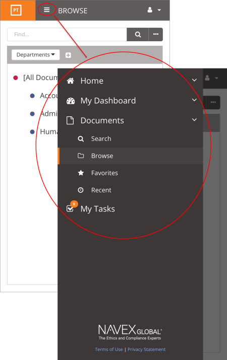
Depending on the current screen width, the sidebar menu that usually appears on the left automatically may be hidden when you first log in. To display the menu, click in the header.
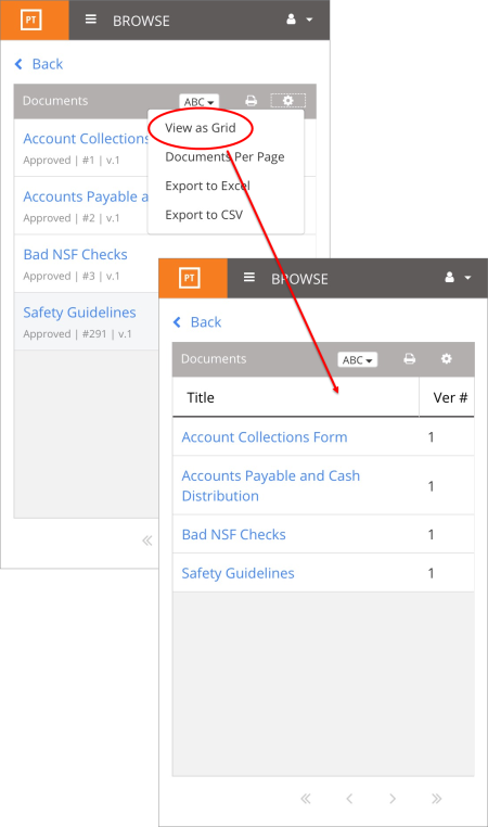
When using Search or Browse, matching documents are shown in a list by default, with document details shown below each document title. To show documents in a grid with document details arranged in columns (as in the full PolicyTech application), in the document list header, tap  , and then tap View as Grid. Scroll to the right to see additional columns.
 Screenshot...